Flevoo
Access the essentials without opening the app
The observation
An invisible but daily friction
On this type of app, users open the app multiple times a day to check a single piece of information. Each opening requires loading time, navigation, sometimes a login. Most of these sessions last less than 30 seconds. The friction isn't in the app, it's in having to open it.
The discovery
Understanding what users are really looking for
I conducted a discovery phase by analyzing how users interact with existing fuel apps on the market. A recurring pattern emerges: the majority of openings concern a limited number of data points. Have prices dropped? Is my usual station still the cheapest? Is there a shortage? Three questions that don't require opening a map.
The insight
Information should come to the driver, not the other way around
The problem isn't the app's interface. It's the fact that the user has to go get the information. The design direction: a product that pushes price information at the right time, in the right place, and learns from refueling habits to anticipate the need.
Marc, 42, daily commuter
He fills up once a week, always in the same area. He opens the app 3 to 4 times before going to the pump to check if prices have changed. Most of the time, nothing has changed.
Sophie, 29, tight budget
She monitors prices constantly to find the best time. She opens the app preventively "just in case" of a drop, often to find that prices are stable.
Explored concepts
Three channels to bring the price to the user
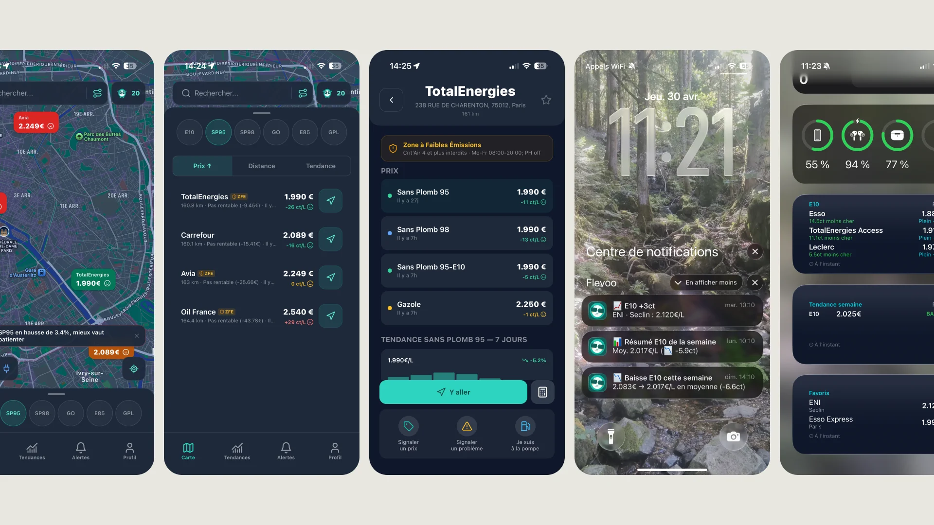
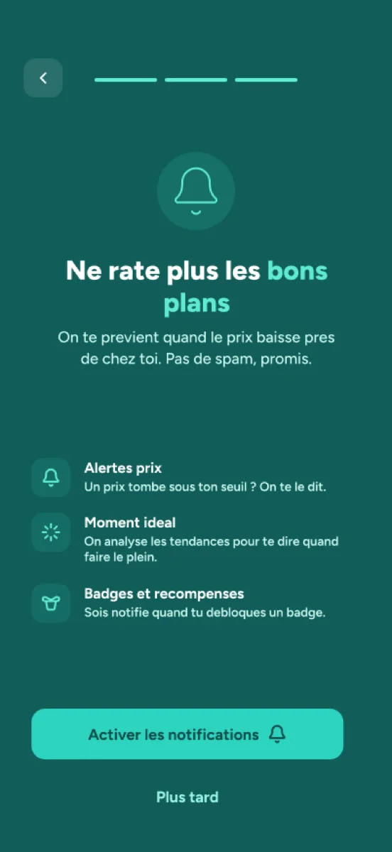
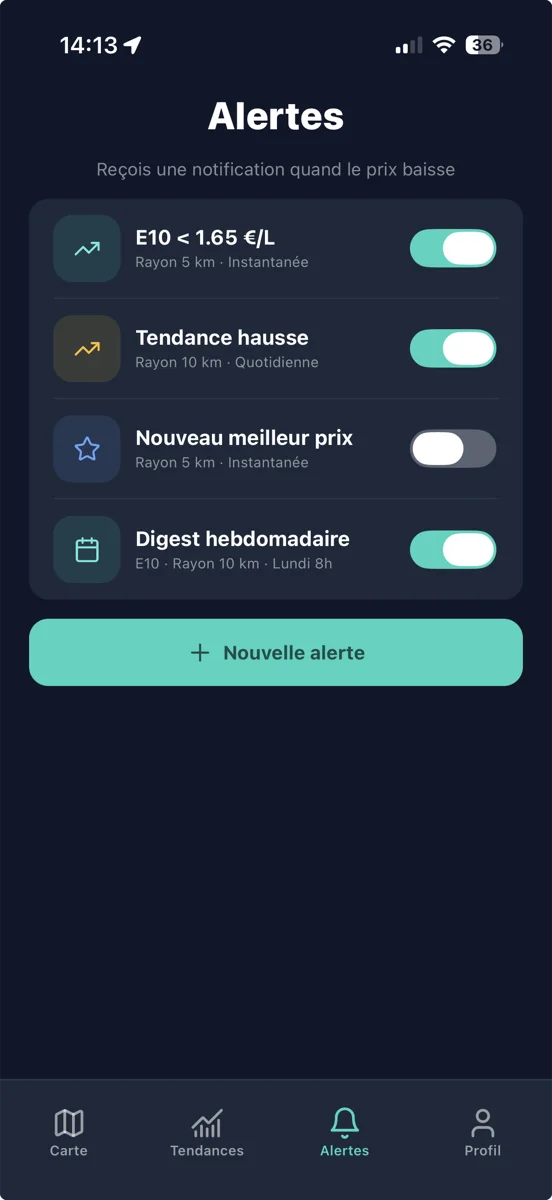
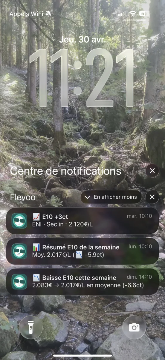
Contextual notifications
Alert when the E10 price drops below the set threshold (e.g. E10 < 1.65€/L), weekly zone trend (e.g. E10 drop, 2.083€ → 2.017€/L average), fuel shortage alerts, post-fill geofencing reminder. 12 notification types, each triggered by a concrete event.
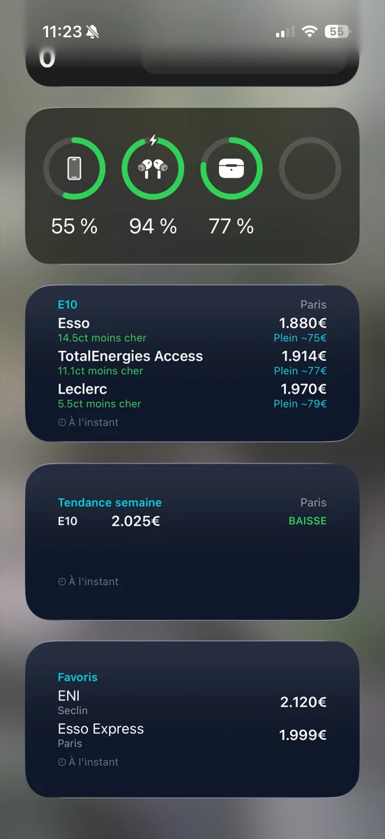
Dashboard widget
Top 3 cheapest station prices visible from the home screen (e.g. Esso 1.880€, TotalEnergies 1.914€, Leclerc 1.970€), with savings in cents and estimated fill cost. Weekly trend and favorite stations at a glance, without opening the app.
Adaptive summary
Personalized digest that adapts to the refueling cycle. If Marc fills up on Tuesdays, the digest arrives Monday evening with his zone prices (e.g. Weekly E10 summary, Avg. 2.017€/L, -5.9ct). Content and timing evolve with usage.
The three channels complement each other. Notifications handle changes (price drops, shortages), the widget provides permanent access to favorite prices, the adaptive summary anticipates the need before the user thinks of it. The app remains complete for the map, route search and community contributions, but price checking moves outside the app.
The prototype
Validating information logic before designing screens
I first validated on wireframes which data to display in each channel. The widget had to answer 'should I fill up today?' in under 3 seconds. The notification had to be actionable: a tap opens navigation to the station. The digest had to evolve after two weeks of usage to match the user's actual refueling cycle.
What it changes
The full app stays, the friction disappears
The app keeps all its features: interactive map, routes, community contributions, gamification. What changes is that users no longer need to open it for simple questions. They open the app when they need to act (plan a route, contribute a price), not when they need to know.
The app is currently in beta testing. Early feedback will measure which channels reduce low-value openings the most, and how the adaptive summary aligns with users' actual refueling habits.
Flevoo
Access the essentials without opening the app