Deezer
Organize your playlists by musical intensity
When platforms automate the mix, the listener loses control
For years, on the Deezer, Spotify and Apple forums, the same request keeps coming back: being able to reorganize a playlist by its intensity, to follow a build-up of energy as much as a wind-down toward sleep. The platforms eventually took up the topic, but always through automation: Apple Music launched AutoMix in September 2025 to blend tracks like a DJ, and Spotify followed with Smart Reorder in February 2026, reordering a playlist by BPM in a single tap. In both cases, the algorithm decides in the listener's place. This concept makes the opposite bet: making the sorting explicit, so the listener chooses the direction of intensity themselves, depending on their moment.

One need, two uses
Behind this need, two uses keep coming up. Managing your energy through a workday, shifting from focus to relaxation without changing playlist. And supporting effort, building up intensity gradually without interruption. In both cases, the listener is stuck with an order they didn't choose.
She uses music to manage her energy throughout the day. She alternates between focus and relaxation but has no way to switch moods without creating a new playlist.
Camille
34 / Remote worker
He creates long playlists for his runs but spends 10 minutes manually reordering before each session. He wants to build intensity progressively without interrupting his flow.
Lucas
28 / Runner
Translating BPM into intensity, for novices and experts alike
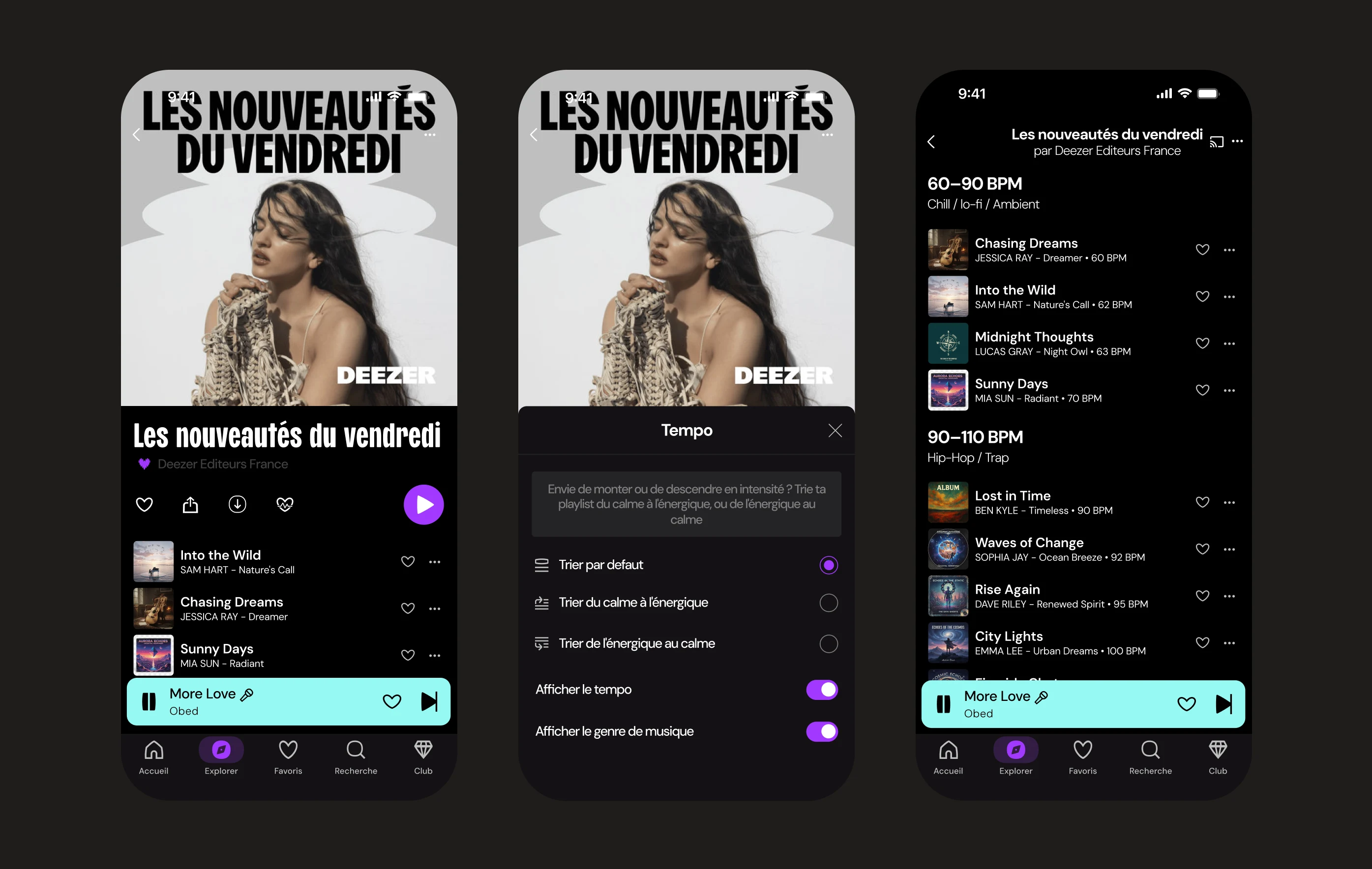
Giving control back to the listener raised one question: how far? Reordering a playlist track by track means understanding what raises or lowers the energy, a technical notion not everyone has. Left on their own, an untrained user breaks the flow more than they build it. So the choice was to sort the entire playlist in a single gesture, along a direction of intensity, rather than delegating a risky manual reordering.
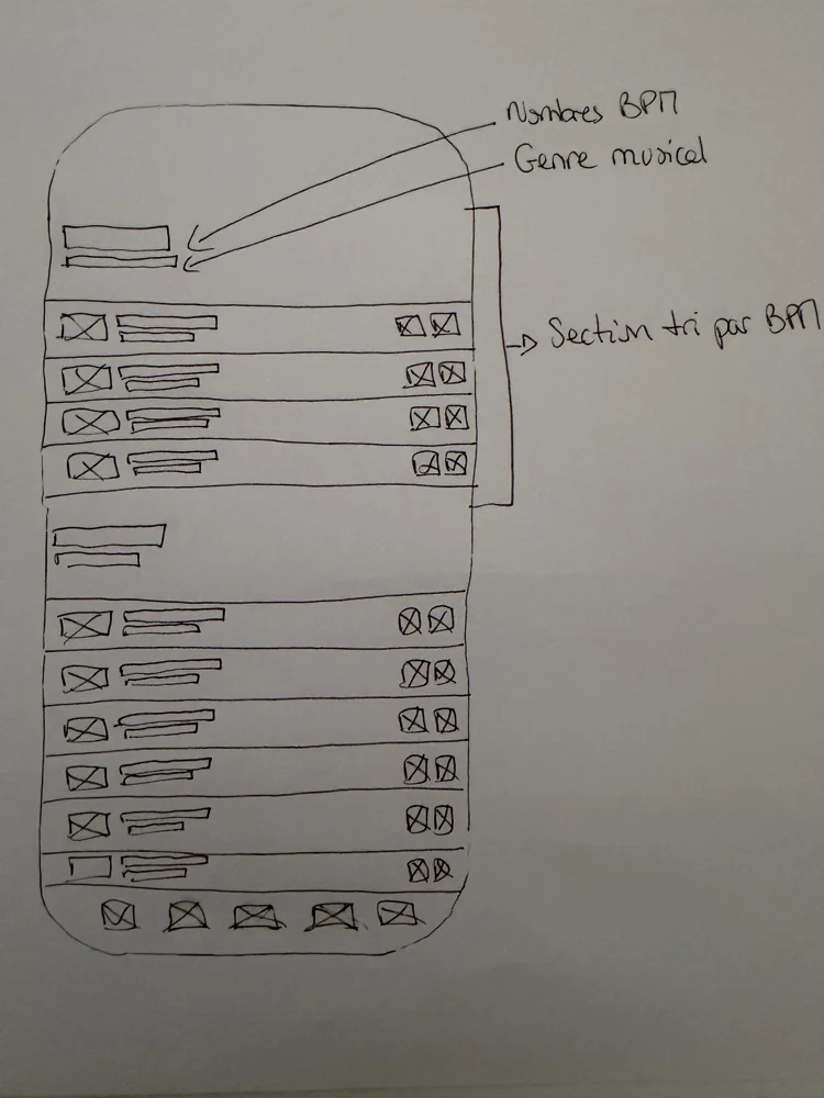
Same logic for the display: BPM and genre are hidden by default. For anyone who simply wants a build-up toward effort or a wind-down toward calm, this data clutters more than it helps. It stays available as an option, for listeners who want to read the detail. Intensity thus becomes the only visible language, while BPM works behind the scenes.
A single entry point, zero new habits
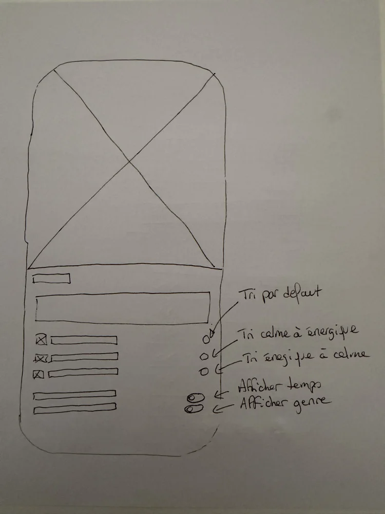
Before moving to high fidelity, the flow was validated on wireframes to check that it fits naturally into the existing experience.
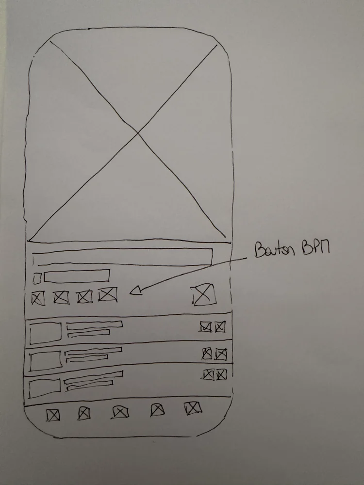
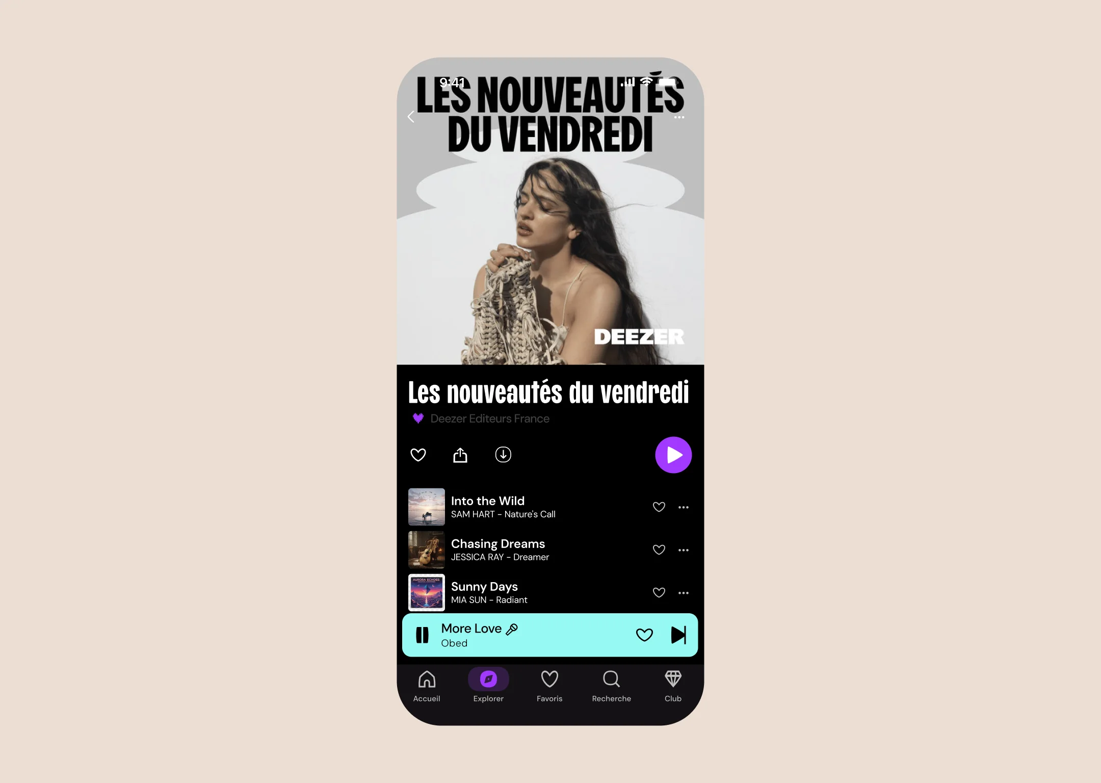
The BPM icon fits into the existing action bar, zero disruption to the usual flow.
The user taps the icon and the panel opens. They choose a sort direction to reorganize the playlist by intensity, with the option to display tempo and genre.
The need validated, one adjustment for what's next
It remained to be seen whether the concept would hold up with real listeners. Four testers, two tasks: organize a playlist, navigate the sorting options. The flow held, everyone completes it without a hitch. Usage confirms the initial intuition, a situational need, shared equally between sport and evenings. One thing stood out, the heart + cardiogram icon (too discreet) half the testers don't spot it right away. That's what the next iteration will fix, with level bars, a lead that came from the testers themselves.
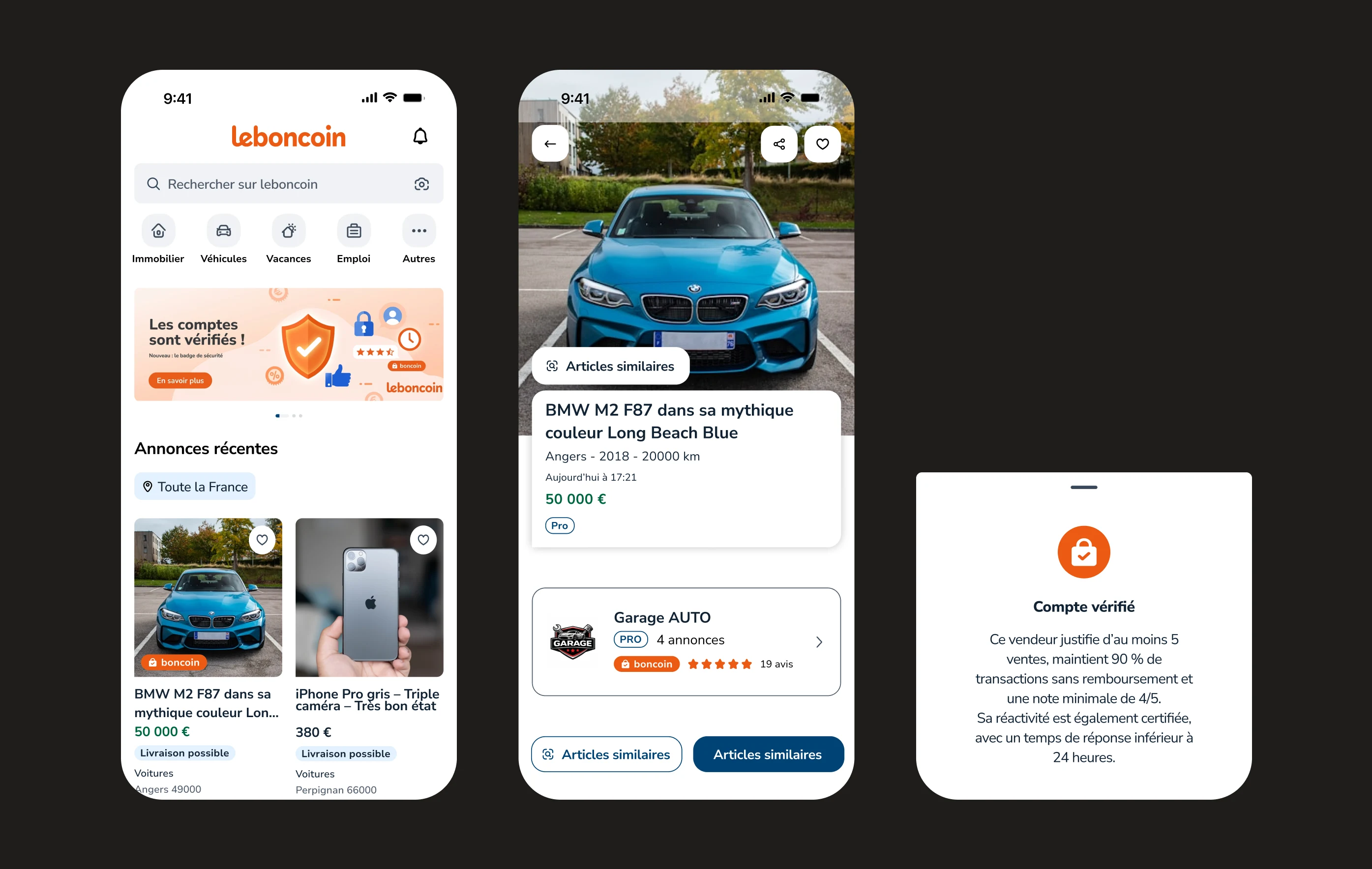
Leboncoin
Designing trust on a marketplace